UJET Demo Room Virtual Experience
Prospective customers were not able to quickly glean how UJET stands out from the its competitors from the existing website. In-person demos are time consuming and not scalable. I worked with a web developer, marketing communications specialist, and visual designer to design and build a virtual demo experience.
Close collaboration with our sales and leadership teams equipped me to design an experience that would generate leads and communicate our key offerings in an engaging, non-intrusive way. I wrote the script for the demo with the visual designer, and I mapped out a comprehensive user flow to define the experience. I then wireframed every touchpoint, first in low fidelity and then in medium fidelity, complete with specs on the interactions. The web developer and visual designer then took it to high fidelity and built it. The marketing communications specialist edited the script and ensured that it told a story in an appropriate tone and voice. Throughout the process, I QAed the experience to ensure it worked as intended.
Skills
Script writing, user flow, UX design
Impact
This interactive experience generates leads for our sales team and allows anyone visiting our website to see the magic of Smart Actions in a visual, interactive way. It demonstrates what is unique about our product more effectively than static words or pictures do, without requiring an in-person demo.
Demo Room Video
This is a walkthrough of the live experience.
Script
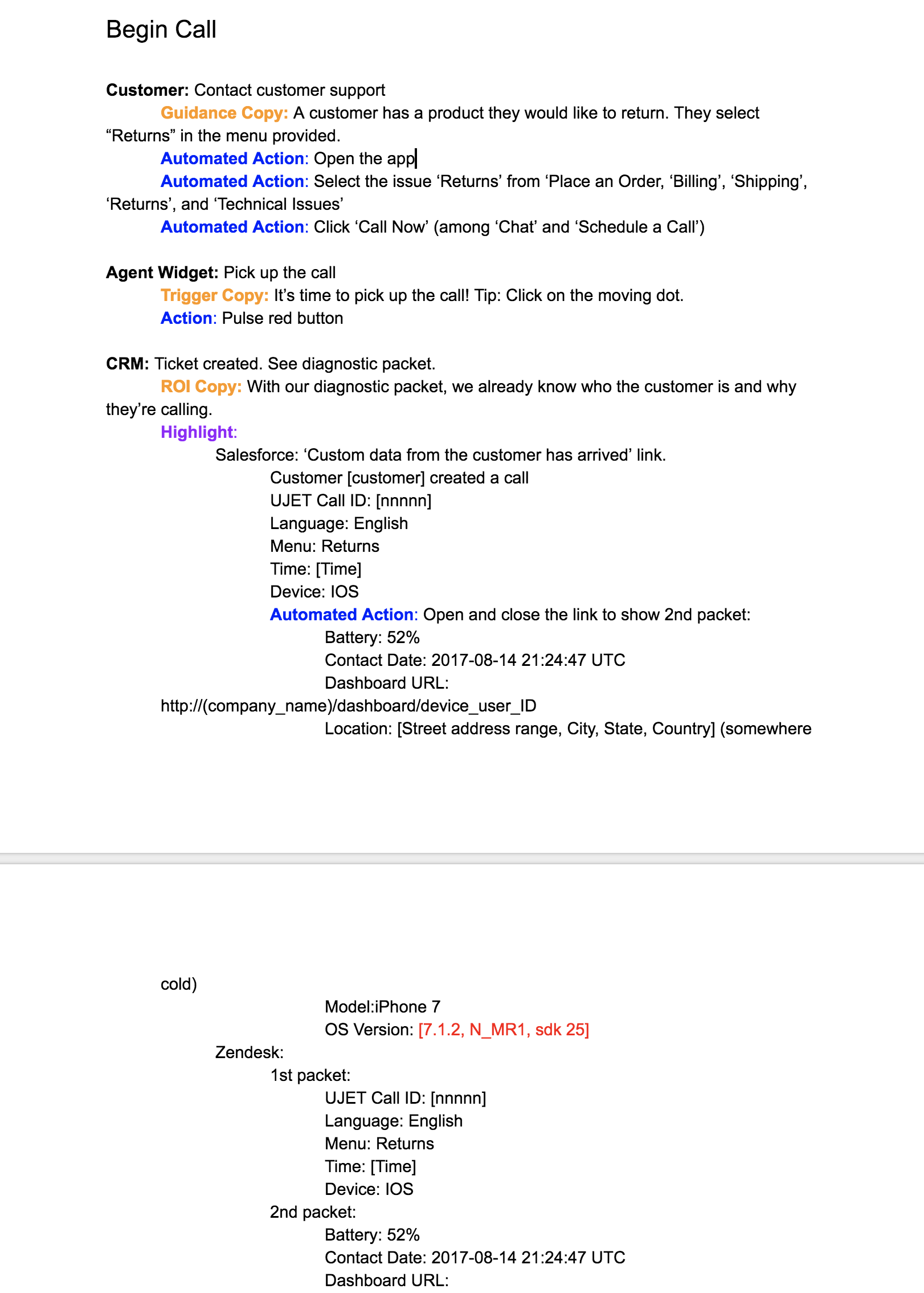
The script was the first step in defining the experience. My goal in writing the script was to tell a compelling story that potential leads from any industry would find relatable.
The script told a story while defining the different types of copy. I tested the agent experience with different CRMs and adjusted the script to adapt to each of the major CRMs we support: Salesforce, Zendesk, and Kustomer.
User Flow
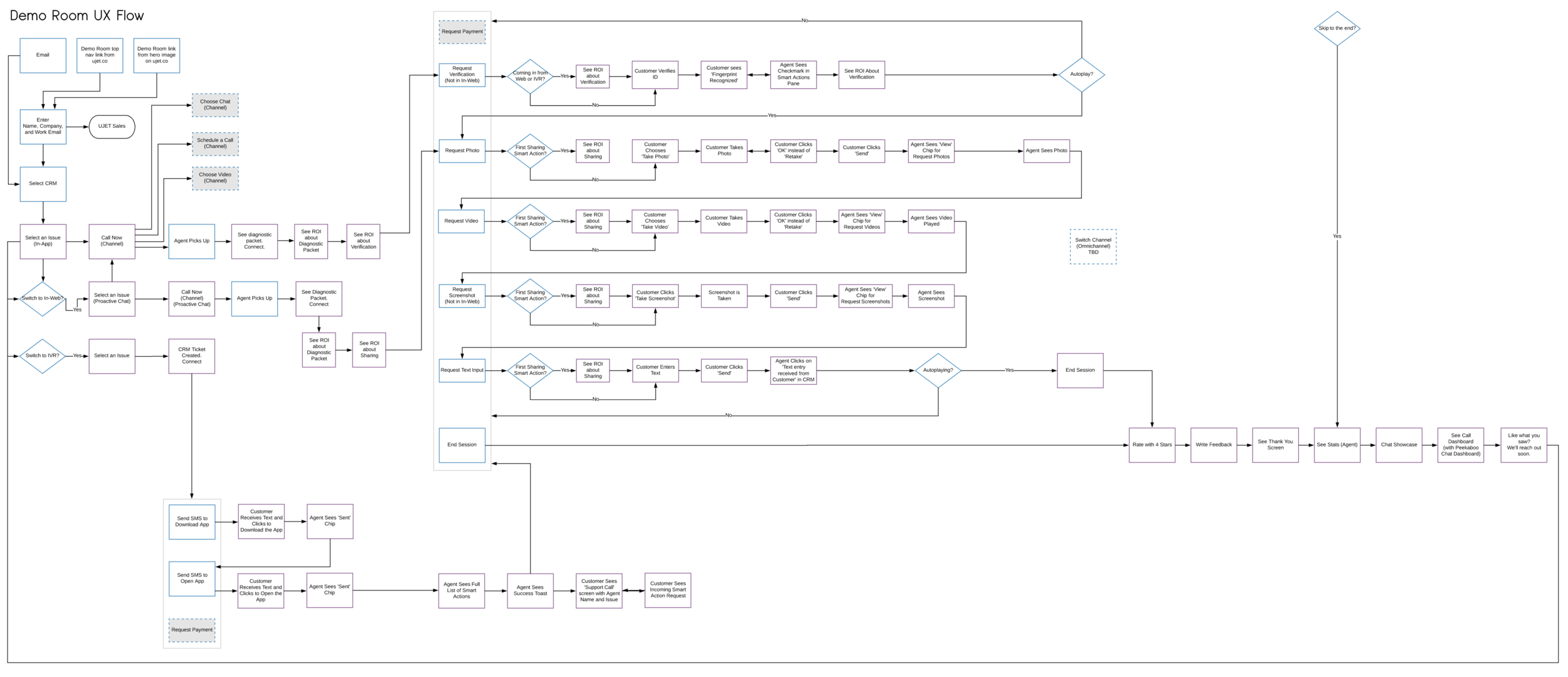
Creating a detailed user flow made it possible to get every part of the experience right before focusing on visuals. It was instrumental in communicating to everyone involved the entirety of the experience from a high level, and served as the blueprint for the visual designer and web developer to build it out screen by screen into a high-fidelity and functional product.
User flow
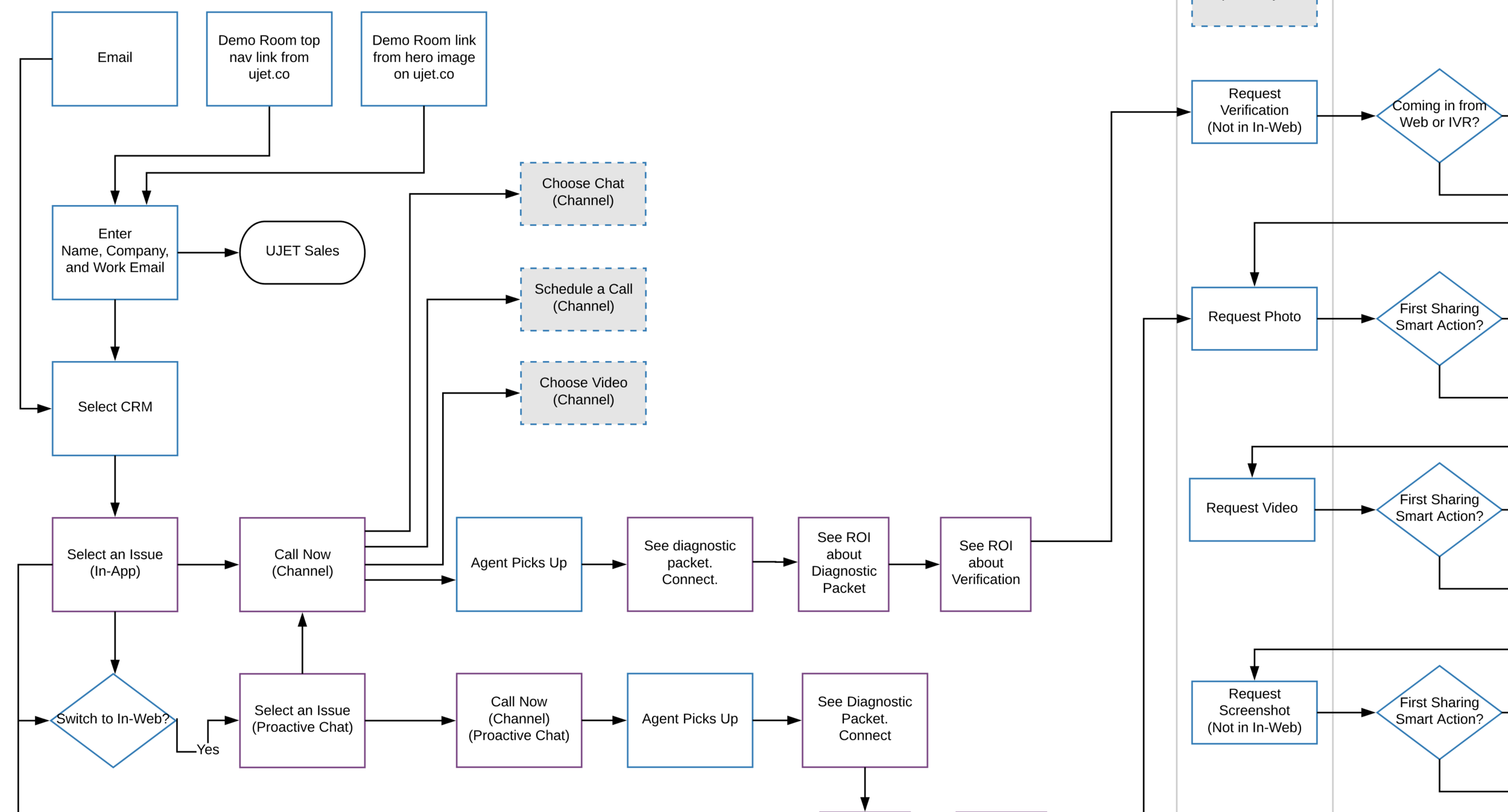
User flow entry points and core pivot points
Wireframes
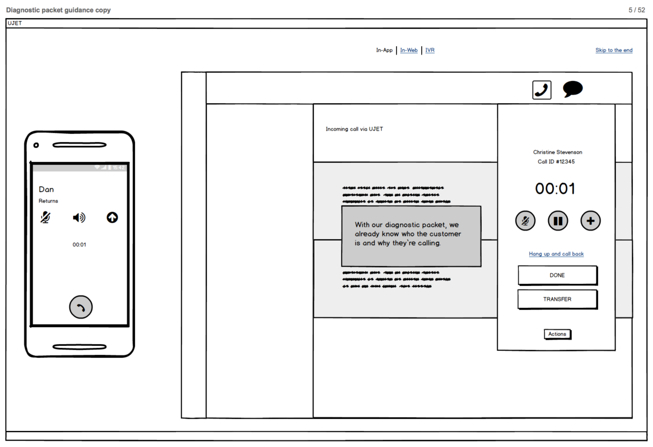
Given that our goal was to have the demo room virtual experience ready for an upcoming conference, I quickly wireframed 50+ screens and spec'ed the interactions in Balsamiq. Together with the user flow, the wireframes equipped the visual designer and web developer to build out the experience.
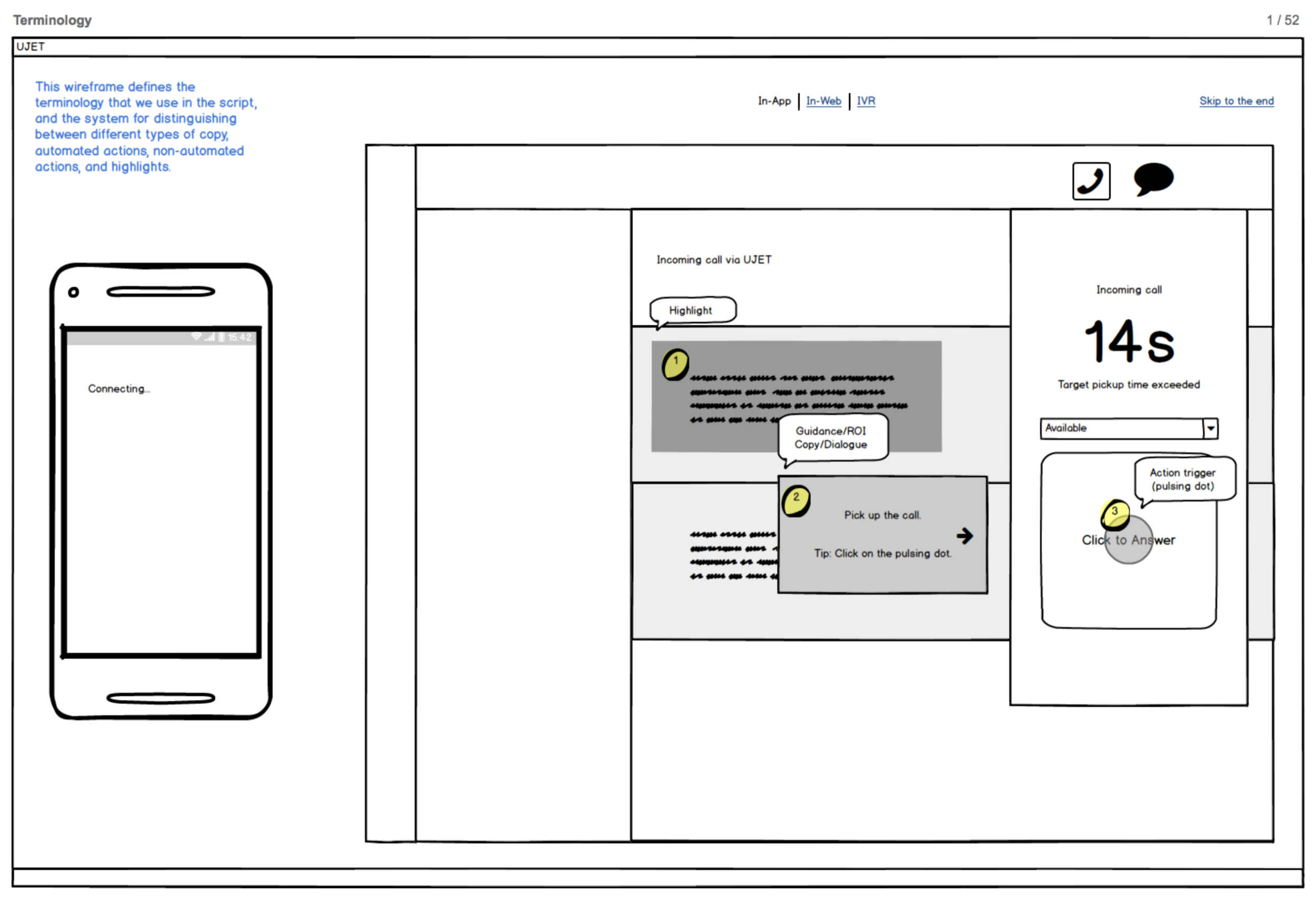
Since we were inventing a new paradigm for this experience, it was important to establish a common terminology within the team so that we were clear on the different types of content.
The agent and customer have begun a simulated call. Our ROI copy highlights the ways in which UJET contextualizes the support session for the agent before the customer has to say a word.
Research & Iteration
We received a very positive reception from the stakeholders and the company through internal testing. Members of the team did guerrilla testing with the sales team, and I iterated on the designs based on the feedback. Some of the design decisions I made centered around:
- Telling a compelling story agnostic of industry
- Soliciting just enough information from the visitor without causing them to bounce
- Clearly distinguishing between the interactive portion of the experience and the automatic ones
- Indicating a next step
- Indicating progress in a variable Choose Your Own Adventure-type of experience
- Timing that allows the visitor to comprehend the message while making rapid progress through the experience
What's Next
The marketing team is currently revamping the website to better reflect our capabilities at this stage of the company.
Next Project:
