Stitch Fix Orders
Before I designed and shipped the customer-facing Orders page, customers had no place to go to see if their orders were on their way, or start a refund. They had to write to customer support to ask for a refund, and check their bank accounts to see if their refund went through. Take it from me, poring through my account statements was painful!
On the agent side, before I designed and shipped the agent-facing Orders page, it took 30 minutes to locate a single non-Fix order, because Stitch Fix had recently added the Freestyle direct order business to its existing stylist-curated Fix box offering.
I worked with the two separate development teams, a product manager, the warehouse product team, and the customer experience (CX) team to design, test, build out, and QA both Orders pages.
Our objective was to eliminate friction points surfaced through our most frequent CX tickets, by empowering clients to manage their orders themselves. We had the opportunity to address 30% of existing CX tickets, thereby allowing our business to scale effectively. These common order and account needs included questions about returns & exchanges (>15%), billing questions or payment (>10%), and shipment statuses & tracking (6%). It took agents an above-average amount of time to handle these tickets prior to revamping the agent-facing Orders page and shipping the customer-facing Orders page.
Also, because agents previously dealt with single-item orders (ala Fixes), there was no data model in place for multi-item Freestyle direct orders. I fundamentally rethought how we handled orders with all the complexities of different shipment and refund quantities that came with multi-item orders.
Skills
UX design, product strategy, UX research, agile development, focus group
Impact
Customers have the power to track and manage their orders and refunds themselves. They no longer have to contact customer support to inquire about their orders. CX saves 30 minutes per ticket pertaining to orders just locating an order. They can now focus on building relationships with our customers and supporting them through more involved, less transactional problems.
User Flow
Based on the order-related CX tickets agents were handling and feedback from customers via Hotjar, I identified a set of key use cases to drive the design of the Orders page for customers and for agents.
Review all orders
Track the status of shipments, returns, and refunds
Initiate an exchange
Inform Stitch Fix of a return + generate a return label
Leave item feedback
Bulk return/exchange
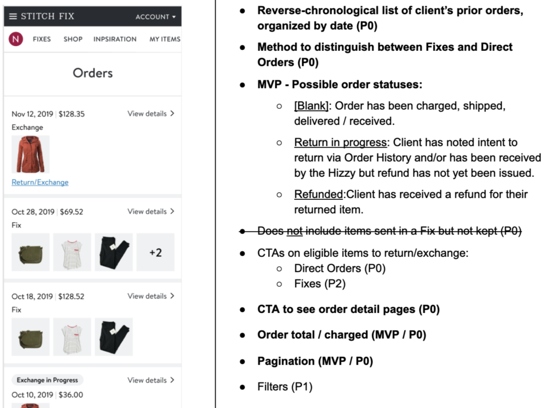
The product manager and I prioritized what to build based on these use cases for both high-level Orders:
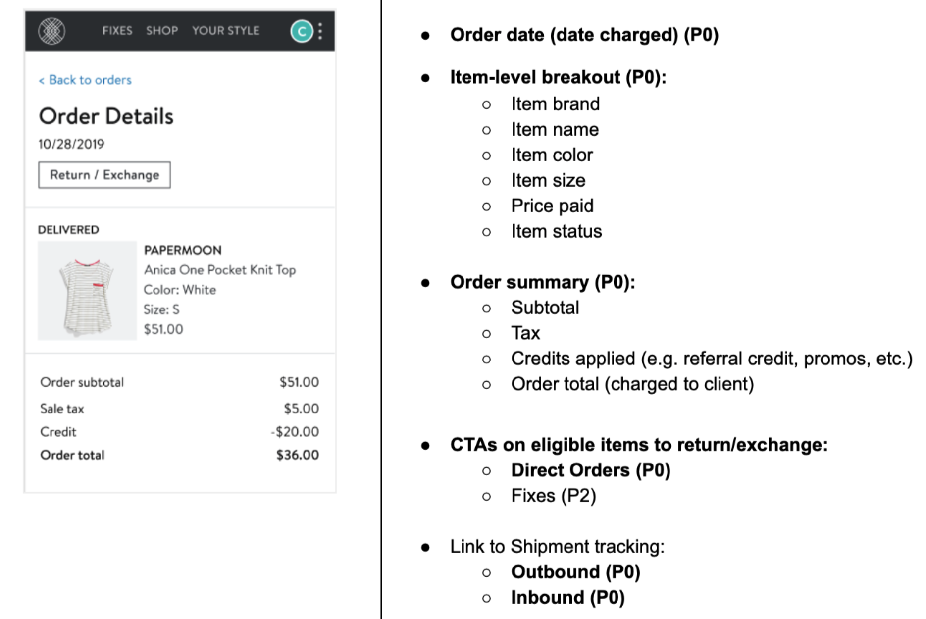
And the details for each order:
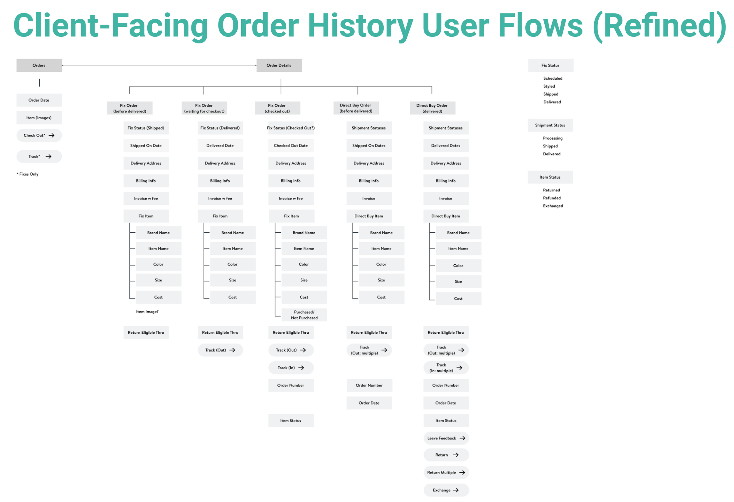
I started out with high-level user flows and got more granular as the project took shape:
Wireframes
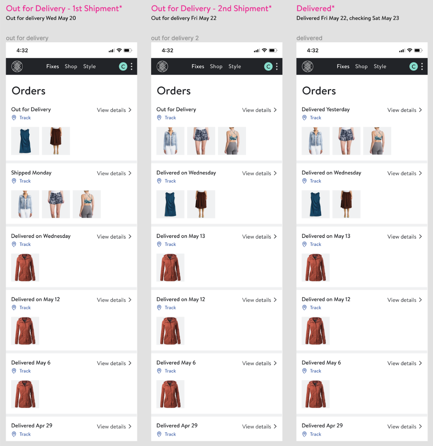
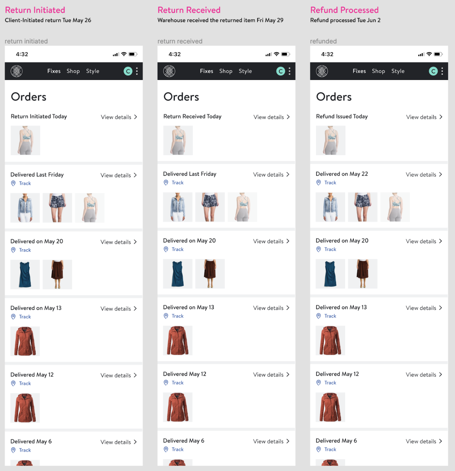
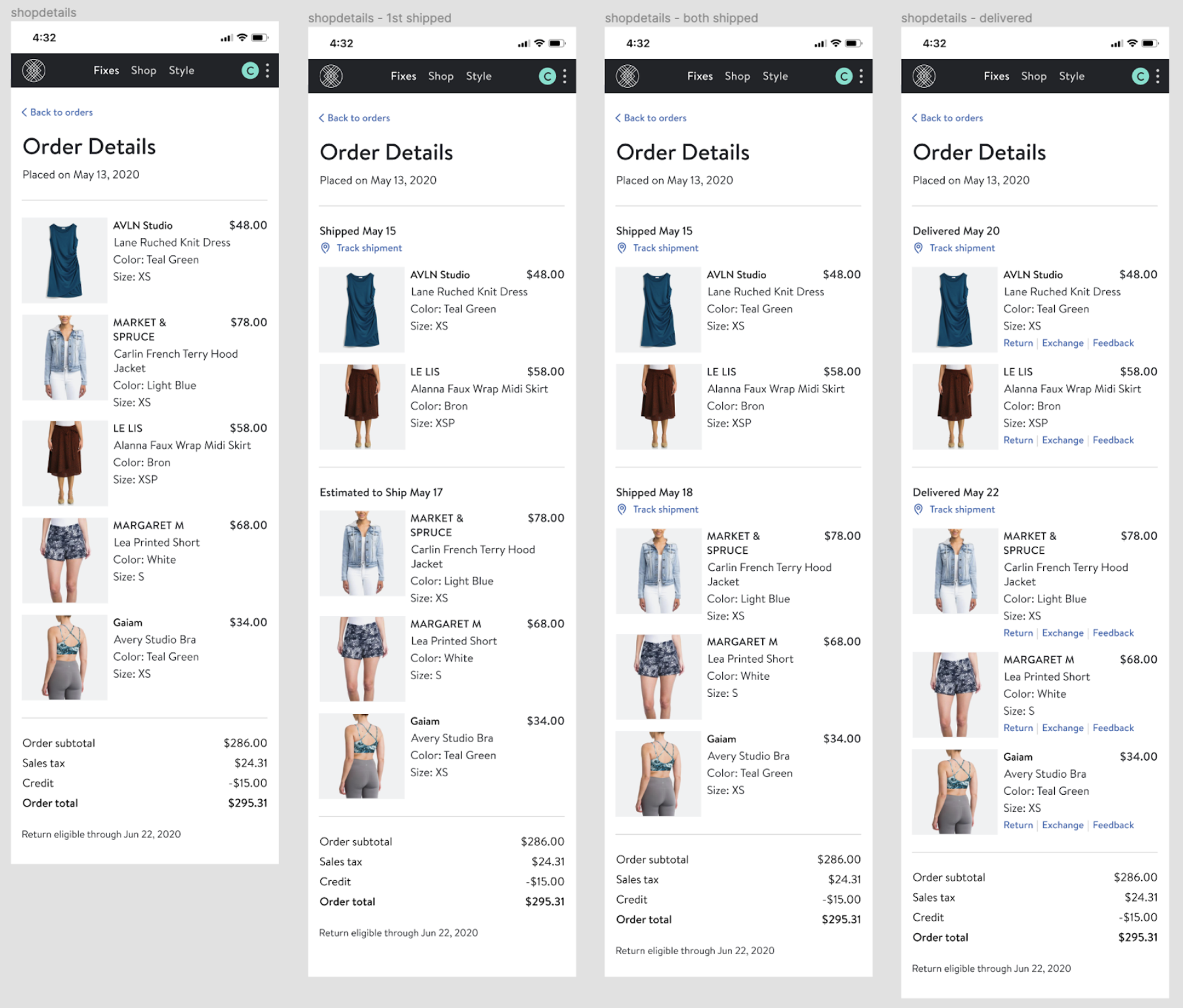
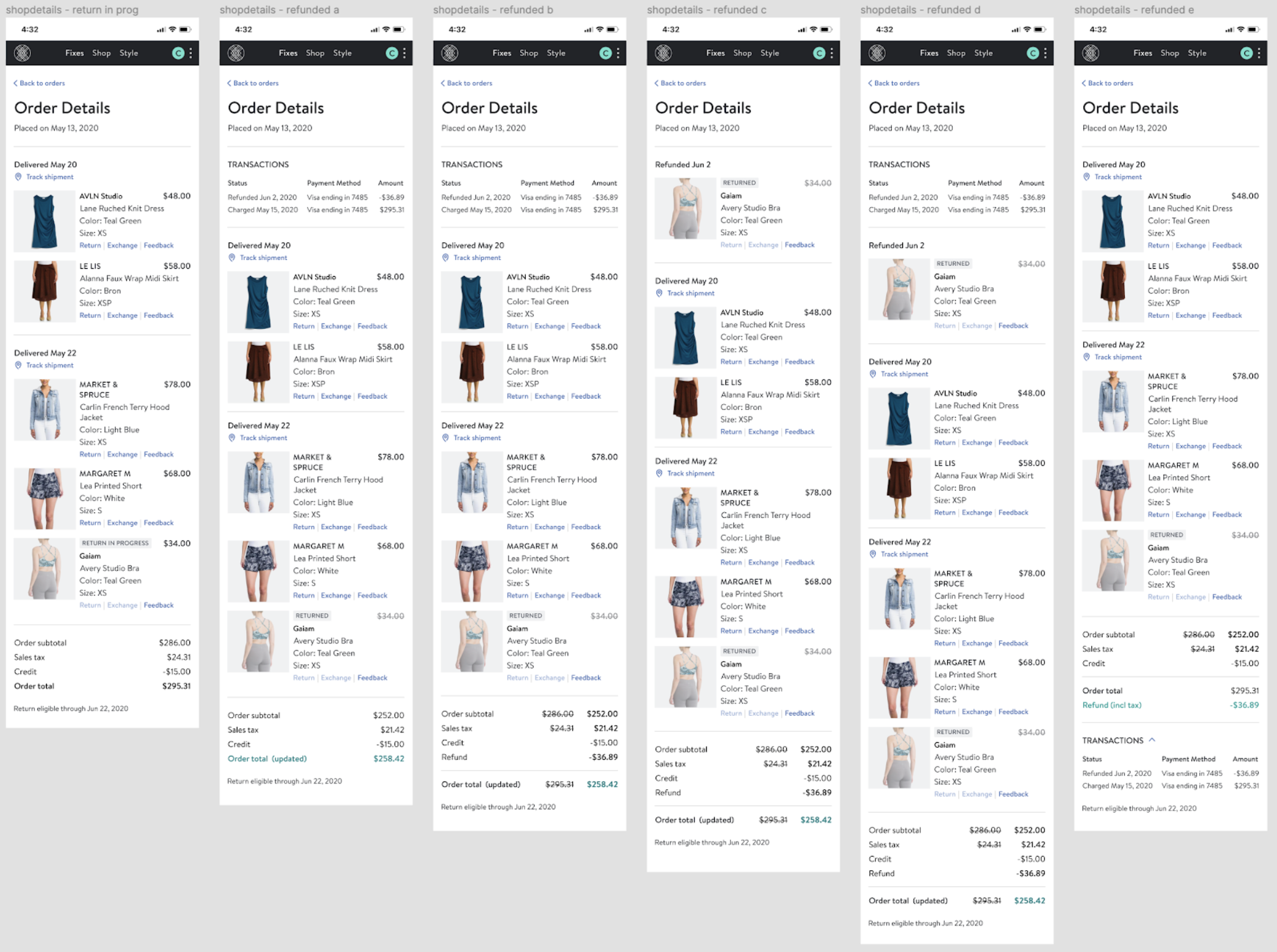
As I iterated on the design, I anchored decisions around whether Orders would address the key use cases of tracking a shipment, tracking a return or exchange and the associated refund for the return, and answering questions about a charge or refund. Simplicity was important to me, along with reducing any friction that might come along with digging deeper into an order. And since I was designing both the customer- and agent-facing Orders pages, I used mental models common to both contexts.
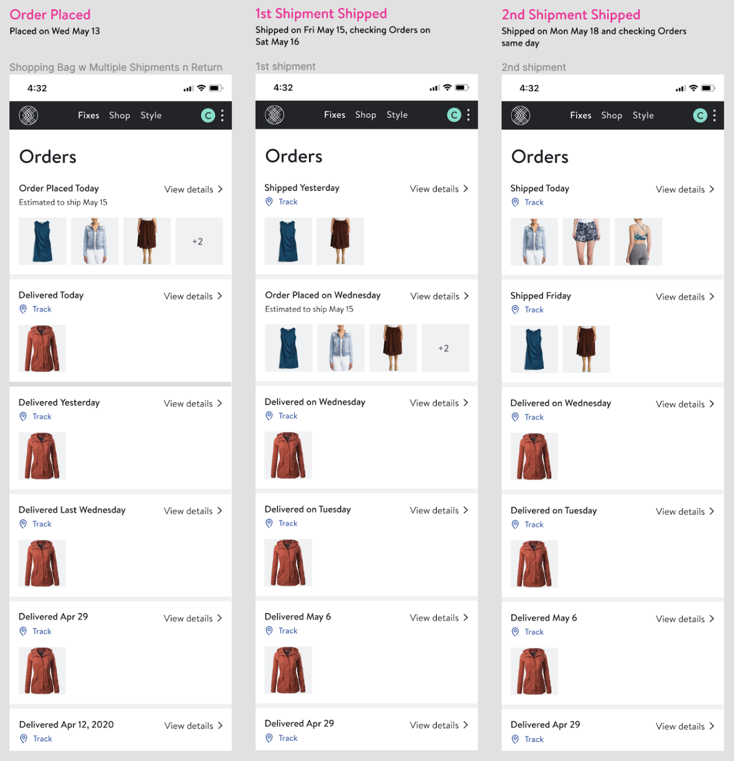
Orders flow through time, so I created realistic and varied scenarios to test the designs against.
The same went for the deeper Order Details page.
Research & Iteration
Throughout the course of the project, the designs went through extensive creative review by the UX team and feature teams, as well as a CX agent focus group. I identified which event statuses around refunds and deliveries were of most interest to customers and pushed to obtain those statuses via package tracking and in partnership with the warehouse team. I also considered which order updates required permanency and how to structure the updates within an order. For example, does ‘Order placed’ persist or fade away after the items have been delivered? We faced certain constraints around the statuses we had access to from carriers: how much of a deal breaker was it that we weren’t integrated with carriers to obtain a ‘Delivered’ status for our direct orders initially? Do customers care that their return has been received by the warehouse, or do they only care about getting their money refunded? If an order is canceled due to fraud, does a ‘Canceled’ status provide relief or erode trust?
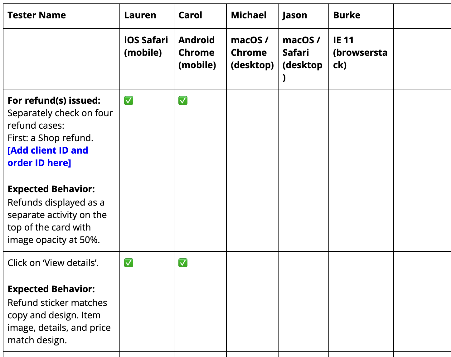
After working closely with each engineering team, we carefully QAed the end product to ensure the experience worked as designed and all use cases were covered. After launch to customers, we continued monitoring Hotjar to continue improving on the experience.
Next Project:
